Associating the Power of Colour Psychology with Interior Designing- 2023
A key component of interior design is colour, which has the power to stir up thoughts, affect moods, and also transform environments. The study of colour psychology delves into the complex interplay between hues and human perception, offering insightful information about how particular tones might affect our mood and experience as a whole in space. Interior designers may build up harmonious, balanced, and functional areas that deeply connect with the people by knowing the concepts of colour psychology.
The importance of colour psychology in interior design will be discussed in this blog post, along with how different colours can be used to generate various effects. Understanding the fundamental characteristics of colours is crucial before delving further into colour psychology. The primary, secondary, and tertiary colours of the colour wheel serve as a fundamental tool in interior design.
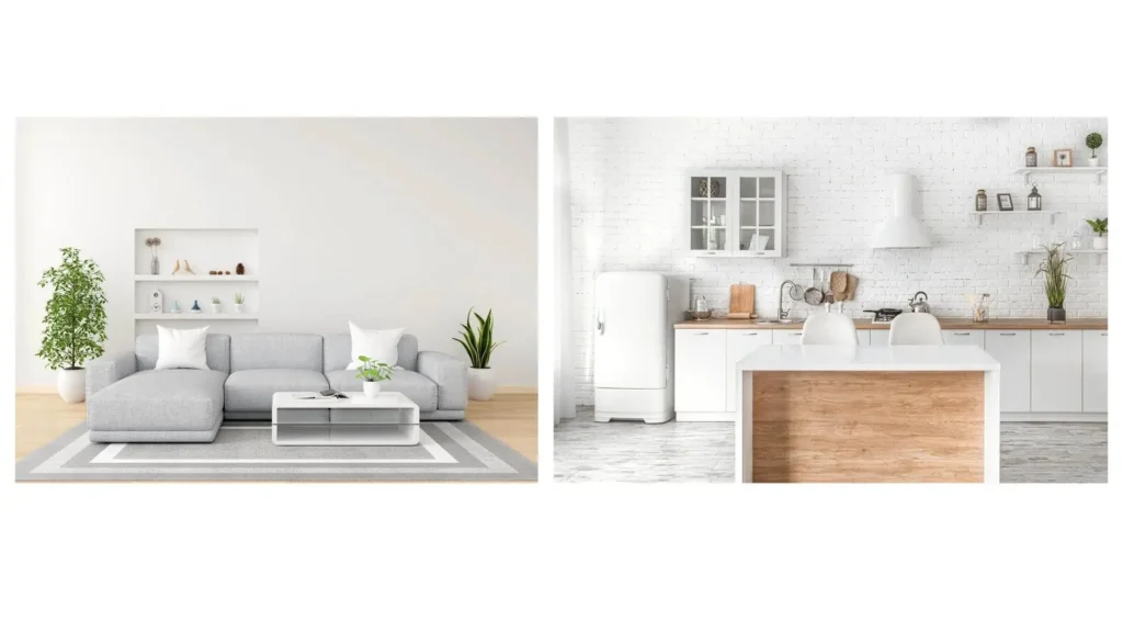
The wheel’s colours each evoke unique feelings and associations. Warm hues like red, orange, and yellow are frequently connected to vitality, zeal, and warmth. On the other hand, cool hues like blue, green, and purple encourage relaxation and peace. White, grey, and beige, which are neutral colours, offer a sense of balance and adaptability, while black can give a sense of space, depth and sophistication.

Colours have a significant emotional impact on us, and we Architects make use of this. Here are some examples of how different colours have an impact on how we feel:
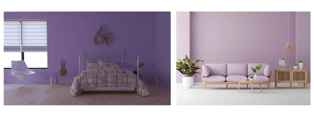
The colour Purple inspires imagination and spirituality and is frequently connected with luxury and creativity. While richer purple shades can give a bit of drama and luxury to a space, lighter lavender colours can promote tranquillity and serenity.
Blue has a calming effect on the mind and body and is frequently linked to serenity and calmness. Darker blues can generate a sense of depth and stability in living spaces, while lighter shades of blue can encourage relaxation in bedrooms or spa-like bathrooms.

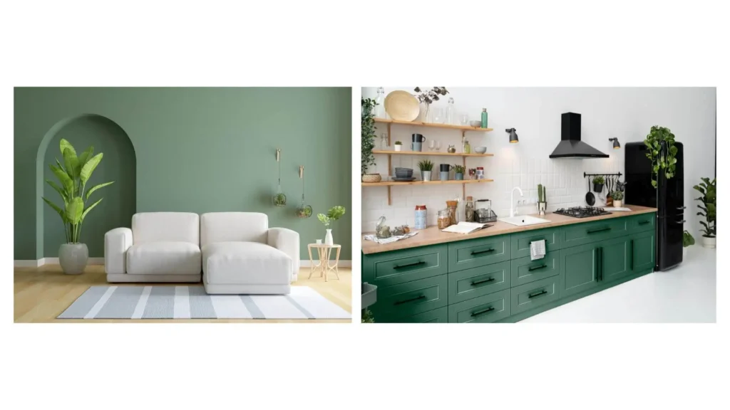
Since Green is the colour of nature, it stands for expansion, harmony, and regeneration. It is a great option for bedrooms, home offices, or anywhere where a connection to the outdoors is required because it is connected with calmness and balance.
The colour Orange encourages excitement and sociability due to its energising and enlivening nature. In public areas like living rooms or dining rooms, it can be used to create a lively and friendly ambience.

Known for its vitality and vivacity, Red inspires fervour, excitement, and even hunger. It can be used as an accent colour to bring life to a room or as a focal point to draw attention to one particular area.

Even though individual colours can trigger certain feelings, the connection between various hues in a room and the overall colour scheme should be taken into account. When choosing colours for a room, keep in mind that they each stir up various feelings and energy. For instance, calming blues and greens are appropriate for bedrooms and relaxation areas while energising yellows and oranges can be used in socialising spaces. To produce a striking and dynamic contrast, choose colours that are adjacent to one another on the colour wheel.
For instance, combining the colours blue and orange can provide startling and balanced results. To achieve a stylish and cohesive appearance, you can stick to different tints and hues of a single colour. This strategy keeps the colour palette consistent while allowing for depth and variation. Start with the base of a neutral colour scheme, such as whites, greys, or beige, and then add highlights of vivid colours. This method still manages to provide visual interest while allowing for flexibility and variety.

The overall impression of an interior space can be substantially improved by the judicious use of colour accents. It is possible to create centrepieces and call attention to particular regions or features within a room while maintaining a colour scheme that is largely neutral. While implementing colour accents, it is crucial to strike the right balance. A chaotic or overpowering impact can be produced by an excessive number of eye-catching colours. Instead, choose a few essential components or regions to emphasise with colour accents, ensuring that they go well with the overall colour scheme and add to the intended emotional ambience.
Colours can have cultural or personal implications in addition to their basic psychological effects, which should be taken into account when designing an interior space. For instance, while in certain Eastern cultures white is a symbol of sadness, Western cultures frequently connect white with purity, celebration, and cleanliness. Similarly, many Asian cultures regard Red as lucky and auspicious, making it a common choice for festive places and occasions. Designing for clients while taking into account these cultural quirks can be extremely helpful. Furthermore, based on past experiences, recollections, or personal preferences, people are likely to connect with some particular colours.
While some people may be drawn to colourful and striking colour schemes, others may find comfort in earthy colours that connect them with natural surroundings. Space may be made to feel incredibly personal and emotionally resonant by carefully selecting colours that represent the person’s personality and preferences.
Architects create environments that not only seem physically appealing but also trigger particular feelings and improve the overall experience of those who live by using colour psychology. As Designers, we use the power of colour psychology to create aesthetically pleasing, well-balanced, and functional interiors by understanding how various colours affect perception and mood. The thoughtful choice and use of colours may change a room into a personal refuge that connects with the occupants, whether the goal is to create a peaceful bedroom or a colourful communal environment. In order to build environments that actually speak to the emotions and aspirations of individuals who live in them, embrace the power of colour and allow it to influence the design decisions.
Book your free consultation call with our expert interior designers now! Contact us today.